The Happiness Olympics

Self-reported “happiness” is not uniformly distributed around the world. The World Value Survey (“WVS”) asks people to rate how satisfied they are with their life on a 10 point scale ranging from “completely dissatisfied” to “completely satisfied.” Figure 1 shows what percent of respondents rated themselves in each category for the US, and for everyone outside the US. US average Life Satisfaction is 7.4 versus 6.8 for non-US respondents. 27% of respondents outside the US rated themselves in the bottom 5 categories of Life Satisfaction compared to 17% of US respondents. However there were more non-US respondents in the completely satisfied category at 13% vs 9% for the US.
Figure 1: Percent of respondents by self-reported Life Satisfaction rating (10 = completely satisfied)

Every time new happiness data is released, there is a blizzard of articles along the lines of “Why are Danes So Happy?”, “7 Reasons Why Costa Ricans Are So Happy”, “Americans Less Happy Than 30 Years Ago”, “Has wealth made Qatar happy?” and so on. Tables are eagerly produced that rank each country’s happiness as if there were a gold medal we were competing for in the Happiness Olympics. How ironic that happiness has become a competition!
Table 1 shows the WSV 2010-2014 average “Life Satisfaction”, “Financial Satisfaction” (how satisfied are you with the financial situation of your household?), “Happiness” (1-4 scale with 1 being “very happy”), and the World Happiness 2010-2014 Gallup’s “Cantrill Life Ladder” response (which is often described as a measure of happiness). You see that country rankings among this set of countries vary quite a bit depending on which measure of happiness is used. You may be surprised by some of the “Top 10” finishers.
Table 1: WSV 2010-2014 (LS, FS & H) and World Happiness 2010-2014 Average Scores By Country (Country list determined by WSV coverage)
Country
|
Life Satisfaction
|
Financial Satisfaction
|
Happiness
|
Life Ladder
|
LS Rank
|
FS Rank
|
H Rank
|
LL Rank
|
Mexico
|
8.51
|
7.00
|
1.39
|
7.03
|
1
|
3
|
1
|
6
|
Colombia
|
8.39
|
6.70
|
1.52
|
6.46
|
2
|
9
|
6
|
14
|
Qatar
|
8.00
|
7.73
|
1.46
|
6.68
|
3
|
1
|
3
|
9
|
Ecuador
|
7.92
|
6.66
|
1.50
|
5.91
|
4
|
10
|
5
|
23
|
Uzbekistan
|
7.89
|
4.08
|
1.39
|
5.77
|
5
|
57
|
2
|
27
|
Brazil
|
7.84
|
6.21
|
1.74
|
6.93
|
6
|
22
|
19
|
7
|
New Zealand
|
7.65
|
6.88
|
1.71
|
7.25
|
7
|
6
|
16
|
4
|
Uruguay
|
7.60
|
6.64
|
1.81
|
6.41
|
8
|
12
|
27
|
15
|
Thailand
|
7.57
|
6.17
|
1.69
|
6.48
|
9
|
25
|
14
|
13
|
Sweden
|
7.55
|
6.94
|
1.65
|
7.42
|
10
|
4
|
10
|
2
|
Pakistan
|
7.54
|
6.76
|
1.74
|
5.35
|
11
|
8
|
20
|
36
|
Netherlands
|
7.49
|
6.92
|
1.75
|
7.45
|
12
|
5
|
22
|
1
|
Argentina
|
7.49
|
6.52
|
1.80
|
6.59
|
13
|
15
|
25
|
12
|
Trinidad and Tobago
|
7.47
|
5.98
|
1.59
|
6.34
|
14
|
36
|
7
|
17
|
United States
|
7.37
|
6.15
|
1.75
|
7.14
|
15
|
26
|
21
|
5
|
Germany
|
7.36
|
6.62
|
1.93
|
6.80
|
16
|
13
|
38
|
8
|
Slovenia
|
7.35
|
6.06
|
1.98
|
5.97
|
17
|
29
|
42
|
22
|
Philippines
|
7.33
|
6.34
|
1.62
|
5.05
|
18
|
20
|
8
|
41
|
Chile
|
7.27
|
6.00
|
1.92
|
6.67
|
19
|
34
|
37
|
11
|
Libya
|
7.25
|
6.79
|
1.76
|
5.75
|
20
|
7
|
23
|
29
|
Turkey
|
7.24
|
6.17
|
1.82
|
5.31
|
21
|
24
|
28
|
38
|
Kazakhstan
|
7.23
|
6.05
|
1.81
|
5.76
|
22
|
30
|
26
|
28
|
Kuwait
|
7.21
|
7.19
|
1.67
|
6.41
|
23
|
2
|
11
|
16
|
Australia
|
7.20
|
6.32
|
1.72
|
7.34
|
24
|
21
|
18
|
3
|
Peru
|
7.14
|
6.03
|
1.89
|
5.80
|
25
|
32
|
34
|
25
|
Malaysia
|
7.13
|
6.49
|
1.47
|
5.80
|
26
|
16
|
4
|
24
|
Poland
|
7.09
|
5.71
|
1.84
|
5.78
|
27
|
39
|
29
|
26
|
Singapore
|
6.96
|
6.41
|
1.68
|
6.67
|
28
|
17
|
13
|
10
|
Kyrgyzstan
|
6.96
|
6.38
|
1.68
|
5.16
|
29
|
19
|
12
|
40
|
Japan
|
6.91
|
6.04
|
1.78
|
6.03
|
30
|
31
|
24
|
21
|
Taiwan
|
6.90
|
6.39
|
1.84
|
6.27
|
31
|
18
|
30
|
19
|
China
|
6.85
|
6.19
|
2.00
|
5.04
|
32
|
23
|
44
|
42
|
Hong Kong
|
6.85
|
6.64
|
1.89
|
5.51
|
33
|
11
|
33
|
34
|
Bahrain
|
6.79
|
6.54
|
2.12
|
5.73
|
34
|
14
|
51
|
30
|
Spain
|
6.79
|
5.56
|
1.99
|
6.32
|
35
|
44
|
43
|
18
|
Romania
|
6.69
|
5.84
|
2.21
|
5.18
|
36
|
38
|
55
|
39
|
Azerbaijan
|
6.66
|
5.58
|
1.95
|
4.91
|
37
|
42
|
39
|
45
|
South Africa
|
6.63
|
6.13
|
1.90
|
4.64
|
38
|
27
|
35
|
52
|
Jordan
|
6.61
|
5.33
|
1.98
|
5.35
|
39
|
46
|
41
|
37
|
South Korea
|
6.51
|
5.69
|
1.95
|
6.17
|
40
|
41
|
40
|
20
|
Lebanon
|
6.50
|
6.00
|
2.05
|
5.00
|
41
|
33
|
45
|
44
|
Rwanda
|
6.47
|
6.09
|
1.70
|
3.62
|
42
|
28
|
15
|
58
|
Algeria
|
6.30
|
5.99
|
2.06
|
5.69
|
43
|
35
|
46
|
31
|
Nigeria
|
6.25
|
5.69
|
1.64
|
5.02
|
44
|
40
|
9
|
43
|
Estonia
|
6.25
|
5.34
|
2.11
|
5.44
|
45
|
45
|
50
|
35
|
Russia
|
6.17
|
4.87
|
2.10
|
5.59
|
46
|
48
|
49
|
33
|
Ghana
|
6.14
|
4.52
|
1.71
|
4.82
|
47
|
55
|
17
|
49
|
Morocco
|
5.94
|
5.57
|
2.06
|
4.90
|
48
|
43
|
47
|
47
|
Iraq
|
5.91
|
5.85
|
2.26
|
4.74
|
49
|
37
|
57
|
50
|
Ukraine
|
5.90
|
4.54
|
2.16
|
4.84
|
50
|
53
|
54
|
48
|
Yemen
|
5.89
|
4.67
|
2.14
|
4.07
|
51
|
52
|
52
|
57
|
Zimbabwe
|
5.81
|
4.53
|
1.84
|
4.67
|
52
|
54
|
31
|
51
|
Belarus
|
5.78
|
4.78
|
2.25
|
5.64
|
53
|
51
|
56
|
32
|
Tunisia
|
5.58
|
4.96
|
2.09
|
4.90
|
54
|
47
|
48
|
46
|
Georgia
|
5.45
|
4.01
|
2.14
|
4.24
|
55
|
58
|
53
|
56
|
Armenia
|
5.24
|
4.25
|
1.91
|
4.34
|
56
|
56
|
36
|
54
|
India
|
5.08
|
4.81
|
1.85
|
4.64
|
57
|
50
|
32
|
53
|
Egypt
|
4.85
|
4.86
|
3.13
|
4.30
|
58
|
49
|
58
|
55
|
While diving into US happiness statistics is interesting, the big ideological battles are fought using international data. The US is relatively homogeneous with one political system. If you want to talk about social policy, you need to have data across widely different economic and political systems to “prove” your point. In a later post, I will dive into two of the big debate topics: income inequality and personal freedom. But today’s comments will be confined to the topic of global income variations and their relationship to self-reported happiness.
If you compare each country’s average Life Satisfaction score to its average Financial Satisfaction score, it appears there is a strong relationship between happiness and financial well being.
Figure 2: Relationship between average country Life Satisfaction score and average Financial Satisfaction score

The r-squared value of 0.58 means Financial Satisfaction explains about 58% of the variations in Life Satisfaction. But Financial Satisfaction is subjective -- it just tells us about how people feel about their finances, not objectively how much money they make.
If we plot Life Satisfaction versus an objective measure of income like GDP/capita (the version used here is the one economists use which adjusts for currency differences called the “purchasing power parity” GDP/capita), the relationship is not very impressive.
Figure 3: Relationship between Life Satisfaction and GDP/Capita
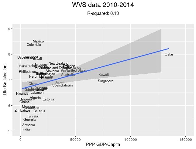
Figure 3 shows that GDP/Capita explains only about 13% of country Life Satisfaction differences -- nothing like the tight relationship Life Satisfaction has with perceived Financial well being. The data shows that Life Satisfaction varies from very high to very low for countries with essentially the same GDP/Capita of $25,000/person or less. Then there is some data that appears to head to the right, with some extreme outliers that are wealthy countries like Qatar, Kuwait and Singapore.
Now if you are anxious to assert that income differences are important to understanding differences in country happiness, you need to manipulate the data or use a different measure of happiness. What many academics do to adjust this data is to theorize that “money doesn’t buy happiness.” More specifically that the happiness benefit from increased wealth diminishes as income grows. On its face, this seems sensible. Going from having no car to having one car can be immensely liberating; going from owning one car to two cars is nice, but probably not as dramatic an increase in happiness as buying the first car.
In a graphical form, researchers apply this insight by taking the logarithm of GDP/Capita. Going from $50,000 to $100,000 is an increase of 100%. Going from log($50,000) to log($100,000) is only a 6.4% increase. So you can see it’s a dramatic de-emphasis of the importance of income growth. Figure 4 uses that transformation.
Figure 4: Relationship between Life Satisfaction and Log(GDP/Capita)

For all those heroics, we now can only explain 19% of the variation in Life Satisfaction with the log of GDP/Capita. The middle of the chart continues to show wide variations in happiness at the same income level.
So let’s use a different question to measure happiness. Let’s use what the World Happiness Index uses to measure happiness: the Gallup Cantril Life Ladder question. The question is put as follows:
- Please imagine a ladder with steps numbered from zero at the bottom to 10 at the top.
- The top of the ladder represents the best possible life for you and the bottom of the ladder represents the worst possible life for you.
- On which step of the ladder would you say you personally feel you stand at this time?
Now this is clearly a different question than the WVS Life Satisfaction question which asks where you are in the range from “completely dissatisfied” to “completely satisfied” with your life. The WVS question is a relatively straightforward assessment of how you feel about your life.
The Life Ladder question’s full name is the “Cantril Self-Anchoring Striving Scale.” It implicitly invites you to imagine the best possible life you could have and then place yourself relative to that. With pervasive showing of TV and film from highly developed countries everywhere around the globe, it would not take much imagination for a person in Nigeria to imagine their “best possible life” would emulate the lifestyle she saw on a film or TV produced in the United States or Europe (especially since films often show glamorous lifestyles) and therefore give herself a relatively low score on the Life Ladder question. The Nigerian might give herself a higher score on the WVS Life Satisfaction question when simply asked how satisfied she was with her life because she likely thinks about her life relative to her neighbors in her community.
Someone in Switzerland asked the Life Ladder question would have a hard time imagining a more affluent country than the one they are living in, and probably give themselves a higher score on the Life Ladder question. But their answer to the WVS question would likely bear less relationship to Switzerland’s GDP/capita level.
So it is easy to see why the Life Ladder question might show more relationship to GDP/Capita than the Life Satisfaction question. And indeed it does. Figure 5 shows the relationship both untransformed and with the logarithmic transformation.
Figure 5: Relationships between World Happiness Index Life Ladder Question and GDP/Capita


GDP/Capita explains 33% of the variation in the Life Ladder response and log(GDP/Capita) explains 54%. But as noted, the Life Ladder question is already a close cousin to the question “do you live in a rich country or a poor one?” (because certainly citizens in poor countries could imagine being rich). So it is not surprising that it aligns with country income. As Deirdre McCloskey wrote in her critical essay on happiness economics:
“Recording the percentage of people who say they are happy will tell you something, to be sure, about how people use words.”
The assertion that increasing wealth has diminishing happiness (the logarithm assertion) has very large political implications. If you believe it’s true, it’s much easier to justify social policies, restraining growth in affluent countries and redistributing wealth. If you don’t believe it’s true, you argue the case vociferously the other way.
For a little more insight, let’s go back and look at how our WSV 80,000 plus respondents around the globe rated both their Life Satisfaction and their Financial Satisfaction relative to another WVS question which asks them which income decile in their country they think they belong to. The chart on the left of Figure 6 shows results for US respondents and the one on the right shows all other responses.
Figure 6: Life Satisfaction and Financial Satisfaction relative to self-reported Income Decile for US and non-US respondents to WVS 2010 - 2014 survey


Both charts show a remarkably similar relationship (even down to the numerical values by decile). People who report they are in the lowest income deciles are much happier about their lives than they are about their financial situation. Of course they are not happy financially, but it seems they are finding other sources of satisfaction to achieve a Life Satisfaction score that is higher than you would expect if happiness is only driven by Financial Satisfaction. The increase in Life Satisfaction is a shallower curve --- as income increases, the gap between Financial Satisfaction and Life Satisfaction narrows considerably.
The other striking thing about this data is there is a pretty consistent Life Satisfaction pay-off as you move from one income decile to the next. There is no apparent income fatigue or lessening of the incremental Life Satisfaction benefit from moving up to the top income deciles.
Now again these are all subjective assessments. Respondents might be wrong about what income decile they belong to. If we take them at their word and convert income decile into dollars (which we can only do for the US respondents), we get Figure 7.
Figure 7: Life Satisfaction versus self-reported Income Decile translated to CBO income after taxes plus transfer payments

Figure 7 is the chart beloved by the “income fatigue” group. What it purports to demonstrate is that income above about $85,000 produces diminishing incremental Life Satisfaction. But how do we square that with Figure 6 which shows steady increases in Life Satisfaction from moving to the next income decile?
One way to square the two charts is to hypothesize that money increases happiness primarily by increasing social rank, not consumption. Owners of large luxury yachts rarely use them, for example, but their boats provide them status. If social status is the primary driver of happiness and my incremental Life Satisfaction payoff to climbing in social status is constant as shown in Figure 6, then the question then becomes “how much does it cost to climb to the next social level?” This flips Figure 7 around to Figure 8, which now illustrates the cost of the next incremental unit of happiness.
Figure 8: “Cost” of achieving the next unit of Life Satisfaction

Why is it increasingly expensive to get to the next unit of happiness as you approach the top decile? Because income is so asymmetrically distributed. It takes $100,000 to move from the 50th percentile to the 90th; it takes $50,000 just to move from the 90th to the 95th percentile. Wealthy people like to compete for social status as much as anyone says Figure 6 -- Figure 8 shows it just costs more.

This perspective explains why the relationship between average country Life Satisfaction and GDP/Capita shown in Figure 3 is so poor. Except for ultra-wealthy “jet setters”, people compete for status within their own communities, not against people in far away countries they will never meet. The relative competition hypothesis also explains why the slopes of the non-US Life Satisfaction and Financial Satisfaction curves in Figure 6 are so similar to those of the US curves -- even though when mapped to dollars the absolute cost of achieving the next income decile is much lower for many countries.
At the end of the day, our sense of happiness is achieved locally with reference to those around us. There are no true international Happiness Olympics. The data shows that feeling like we are well off within our own country does make us happy. But the data also shows that country wealth on it's own has little to do with differences in average national happiness.


Comments