Understanding US Wealth Inequality Trends

Summary:
- Reported US wealth inequality is trending towards levels last seen in the late 1920s. Pre-tax US stocks returns and home appreciation (both disproportionately owned by the wealthy) suggest wealth concentration should be even greater than it actually is.
- Two important factors that have offset higher asset returns are 1) higher taxes on income, dividends, and capital gains, and 2) lower savings rates.
- However, wealth is actually much more equally distributed than the 1920s if one follows generally accepted accounting principles that would capitalize the value of Social Security, Medicare, and pension income.
US Wealth Inequality
Figure 1 from Piketty and Zucman's work in 2014 illustrates the share of total US wealth held by the top 10% (and top 1%). From 1870 on, the top 10%’s share ranged between 67% and a peak near 80% seen in the late 1920s.
Figure 1: Piketty and Zucman, 2014 - US Wealth Shares
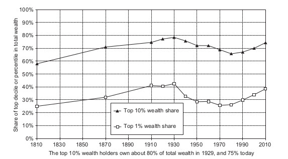
Figure 2 illustrates that wealth is much more concentrated than income. This is true not only in the US, but around the world. For example, in 2011 the top quintile wealth share in famously egalitarian Sweden was 73% when the US top quintile wealth share was 84%.
Figure 2: US Income And Wealth Shares Post 1950 From Kuhn, Schularick & Steins - 2017

This difference between income and wealth concentration is not surprising as wealth represents compounded income advantage over time. Households with little income find it hard to save at all. What is surprising is that the top 10% wealth share has remained relatively stable since 1950 despite the rise in income inequality.
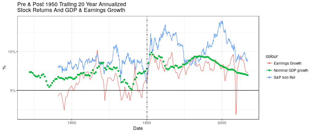
From a longer term perspective, it is even more surprising that wealth is not more concentrated now than it was in the 1920s because asset returns increased after 1950. Figure 3 shows annualized trailing 20 year growth rates of nominal GDP, S&P 500 earnings and S&P 500 pre-tax returns (including dividends) based on Robert Shiller’s data.
Figure 3: Annualized 20 year Trailing S&P 500 Returns & GDP and S&P 500 Earnings Growth
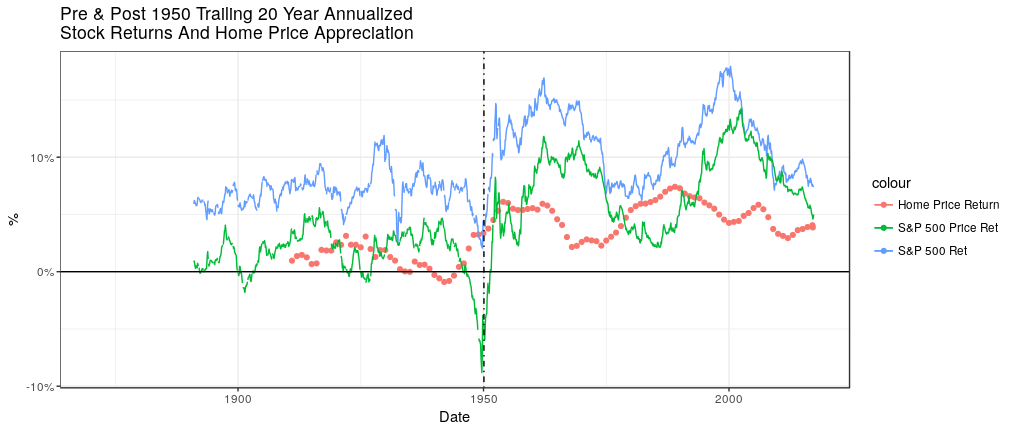
In addition to equity holdings, the largest asset for many households is their home (leveraged by mortgage debt). Figure 4 shows that nominal home price appreciation also followed a pattern of higher returns after 1950.
Figure 4: Annualized 20 year Trailing S&P 500 Total Return, Price Return & Home Price Appreciation
Thus conceptually it should have been much easier to compound wealth after 1950 than in the 1920s when wealth inequality was highest. Why hasn’t wealth concentration exceeded those 1920s levels?
Offsets To Wealth Compounding
One clear distinction between the two periods is taxation. Table 1 lists maximum tax rates on dividends. Notably, while there were no taxes on dividends prior to 1936, from 1954 to 1985 the maximum tax rate on dividends and income was 90%. High income taxes made it harder to save and dividend taxes meant wealth compounded at a lower rate.
Table 1: Dividend Tax Rates
Time Period
|
Tax Rate on Dividends
|
1913-1936
|
Exempt
|
1936-1939
|
Individuals income tax rate (Max 79%)
|
1939-1953
|
Exempt
|
1954-1985
|
Individuals income tax rate (Max 90%)
|
1985-2003
|
Individuals income tax rate (Max 28-50%)
|
2003-Present
|
15%
|
One way to visualize a tax rate of 90% is to compare the blue total return line from Figure 4 to the green price return (excluding dividends) line. The green line represents what would have been realized if all dividends were forfeited to the IRS (instead of 90%). The lower price returns realized post 1950 were similar to the blue total returns prior to 1950.
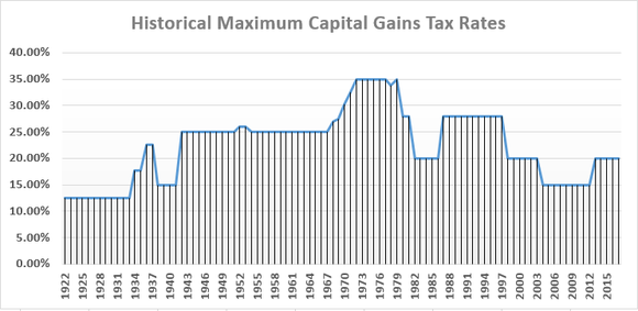
Figure 5 illustrates a similar trend in capital gains tax rates which applied both to the sale of stocks and homes. Capital gains are only realized on sale, so capital gain taxes don’t suppress asset returns as steadily as dividend taxes.
Figure 5: Maximum Capital Gains Tax Rates
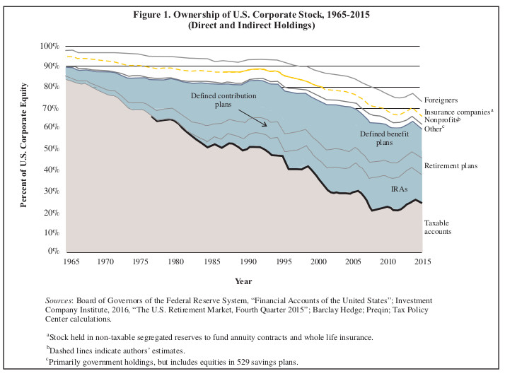
The tax code began to provide some relief to savers through the deferral of real estate gains and the introduction of IRAs in the 1970s which allowed limited savings to grow “tax free” until withdrawn. In fact it is fascinating to observe how little US equity is now held in taxable accounts as illustrated in Figure 6.[1]
Figure 6: Ownership Of US Corporate Stock
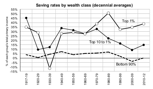
A second key offset to wealth accumulation is the propensity to spend. Figure 7 shows the significant decline since 1950 in the savings rate for all of the top 10% except for those in the top 1%.
Figure 6: Savings Rates From Zucman & Saez, 2015
To summarize, taxation and a declining propensity to save prevented even higher levels of wealth concentration that would have been expected from higher pre-tax asset returns and growing income inequality.
“Effective” Wealth Inequality
If you did not have Social Security when you turned 65, but wanted to purchase an equivalent inflation indexed income stream of $10,000 per year, it would cost you approximately $150,000.[2] Thus, while Social Security is not visible on your personal balance sheet, the creation of Social Security increased your wealth. The same is true for private pension income and Medicare. While Medicare does not provide you with income, it is equivalent to having a significant amount of savings from which you pay your medical bills.
Another way to see this is through current accounting standards which prohibit companies from recording assets on their own balance sheet that they have put aside to fund employee pensions. This is sensible because the assets don’t belong to them, but they belong to someone! They belong to the company’s future retired employees. Those pension assets theoretically should (but don’t) show up on employees’ personal balance sheets.
Corporate pensions were created in the early 1900s, Social Security was created in 1935 and Medicare was created in 1965. Thus none of these “off balance sheet” assets existed or were significant in the 1920s. Therefore the observed wealth concentration numbers from the 1920s are what they are. Fast forward to 2017, however, and those same wealth concentration numbers are now misleadingly low and ignore two of the government’s largest expenditures.
To make an apples to apples comparison using 2013 Survey of Consumer Finances data, Table 2 shows wealth concentration for 65 to 74 year olds both with and without capitalizing pensions, Social Security and Medicare.[3] The 50% income and 77% net worth shares of the top 10% without capitalizing Social Security, pensions or Medicare are similar to those reported by others for the US as a whole.
Table 2: 2013 Survey Of Consumer Finances - Top 10% Wealth Shares With Capitalization of Social Benefits (SCF data from Tables in “Retirement Crisis In America?”)
Age Group 65 to 74 Year Olds
| |||||||
No Capitalization - Bottom 90%
|
No Capitalization - Top 10%
|
No Capitalization - 10% Share Of Total
|
Capitalization - Bottom 90%
|
Capitalization - Top 10%
|
10% Share Of Total
| ||
Income
|
$28,602
|
$262,202
|
50%
| ||||
Wages
|
$7,857
|
$75,427
|
52%
|
Capitalized Value Of Benefit
| |||
Social Security
|
$10,545
|
$14,205
|
13%
|
Social Security
|
$158,175
|
$213,075
| |
Pension
|
$7,576
|
$35,796
|
34%
|
Pension
|
$113,640
|
$536,940
| |
Transfer/Other
|
$901
|
$9,681
|
54%
|
$195,000
|
$195,000
| ||
Interest + Dividends
|
$218
|
$36,818
|
95%
| ||||
Capital Gains
|
$85
|
$31,595
|
98%
| ||||
Business/Farm Income
|
$1,089
|
$55,819
|
85%
| ||||
Assets
|
$172,751
|
$4,407,651
|
74%
|
$639,566
|
$5,352,666
|
48%
| |
Financial
|
$59,889
|
$2,383,099
|
82%
|
$526,704
|
$3,328,114
|
41%
| |
Debt
|
$28,521
|
$129,351
|
34%
|
$28,521
|
$129,351
|
34%
| |
Networth
|
$144,230
|
$4,278,300
|
77%
|
$611,045
|
$5,223,315
|
49%
| |
The table shows that the top 10% share of net worth falls from 77% to 49% when one puts the value of benefits created after the 1920s “on balance sheet.” In other words, “Effective” wealth concentration fell approximately 40% from the late 1920s. This is shown “stylistically” in Figure 7 (I did not estimate values for separate years, but simply smoothly adjusted to the benefit adjusted 2013 end point of 49%).
Figure 7: Stylized Illustration Of Top 10% Wealth Share Adjusted For Social Benefits (As Reported Data From Saez and Zucman, 2015)
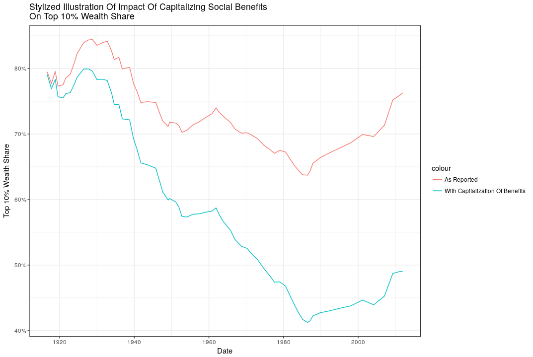
Fair observations would include the fact that social benefits aren’t like other assets because they can’t be sold or passed to heirs (except for a limited time via survivor benefits). They are also difficult or impossible to use to obtain a loan. Nevertheless they are a form of wealth. If individuals didn’t have them, they would need to have reduced consumption and saved more earlier in life to arrive at the same end point. Capitalizing social benefits is a concrete way of looking at changes in wealth redistribution arising from forced savings (pensions) and the implementation of disproportionate tax rates.
The growing equality of effective wealth since the 1920s is a story that is rarely told.[4]
[1] Of course all tax deferred savings from IRAs and pensions are eventually taxed at ordinary income rates when distributed.
[2] Essentially 15 year average remaining life expectancy x $10,000. The discount rate is effectively offset by the expected inflation adjustment.
[3] My capitalization of Social Security and pension income is a very crude 15 year life expectancy times the annual income amount; capitalization of Medicare is taken from Steuerle and Quakenbush, 2015. While a 15 multiple may seem high given the 65 to 74 year age category, redefining the age group to 60 to 70 year olds (centered on age 65 with 80 year life expectancy) would produce nearly identical results.
[4] Though Robert Lerman did in 2011 and Steuerle and Quakenbush have extensively analyzed the trend in capitalized social benefit values.
Transparent and reproducible: I only generated Figures 3, 4 and 7 using the free, publicly-available R program, the data links in this article and in the R code available in “PickettyWealth.r" on github. I also hand calculated Table 2 from tables in my earlier essay “Retirement Crisis In America?” - links to that data are provided in that essay.


Comments